SEO Mobile Site Checklist for Mobile-First Indexing
Mobile devices accounted for an estimated 58.5% of worldwide website visits in 2025, after reaching about 61.0% in 2024, according to StatCounter data compiled and reported by Statista. A mobile SEO audit should start with the pages and templates that bring in visitors, then verify that Google can access the same useful content on a phone as on desktop.
Table of Contents
- Mobile SEO Checklist at a Glance
- Why Mobile SEO Now Decides Most of Your Traffic
- Responsive, Adaptive or Separate Mobile URLs Compared
- How to Check Mobile and Desktop Parity Step by Step
- Core Web Vitals Targets and the Order to Fix Them
- Run the Mobile SEO Tests Before Your Next Release
Mobile SEO Checklist at a Glance
WebinOne sites, like any client site, need to pass six checks on their actual mobile pages. Use this checklist to set a clear acceptance standard before changing templates or releasing a redesign.
| Audit area | Pass condition |
|---|---|
| Mobile and desktop parity | Same primary text, headings, titles, meta descriptions, images with alt text and structured data on both versions |
| Crawlability | Googlebot can fetch CSS, JavaScript, images and CDN paths; no mobile-only noindex or nofollow |
| Responsive layout | Viewport set, text readable without zooming, tap targets spaced, no horizontal scrolling |
| Core Web Vitals | LCP at or under 2.5 seconds, INP at or under 200 milliseconds, CLS at or under 0.1 at the 75th percentile |
| Navigation and internal links | Mobile menu exposes the same internal links as desktop |
| Canonical and hreflang | Mobile pages point to mobile equivalents; no mobile page points only to a desktop URL |
Treat each row as a test, not a design preference. A page can look polished on a phone and still fail if it hides important copy, blocks a resource Google needs to render the page, or drops internal links from the mobile navigation.
The practical starting point is one representative URL per template. Test a homepage, a category or service page, a product page, an article, a paginated list, and each localized version where relevant. Once a template passes, apply the same checks to the rest of its URLs. This catches template-level defects before an agency spends time checking every page individually.
Why Mobile SEO Now Decides Most of Your Traffic
A product page can pass every lab check and still lose the sale: the layout renders, the hero image loads fast, and a cookie consent banner sits on top of the add-to-cart button at the exact moment someone is ready to buy. Search brings the visit. The mobile experience decides whether it converts.
Open your analytics and segment organic sessions by device. Whatever share mobile holds there is the stake, and the mobile version is what Google renders and indexes by default. A page that looks polished on a desktop monitor can still hide copy, cover a call-to-action or push interactive elements out of reach on a phone, and those defects suppress both rankings and conversions before the content ever gets a fair reading.
The regressions that cause this rarely come from the page itself. They come from shared components: a header rebuilt for a campaign that drops internal links from the mobile menu, a tag-manager script loaded onto every template at once, a chat widget or consent banner that shifts position after an update. One component change reaches every URL that inherits it, so a template that passed last quarter can fail this week without anyone touching the page.
Practical rule: Treat every shared component and third-party embed as a change to every page that loads it, and retest one URL per affected template after it ships.
WebinOne projects are tested on every browser and platform before delivery, which sets a clean baseline for each template. Holding that baseline is ongoing work, since each new script, image or module can shift layout or slow interaction on phones.
Responsive, Adaptive or Separate Mobile URLs Compared
Responsive design is the default choice for most client sites because one URL and one HTML response leave fewer places for mobile and desktop to disagree. The choice still has to be proven template by template: a homepage can pass while a product or article template hides copy behind a tab, loads text only after interaction, or serves a different canonical.
| Setup | How phones get the page | Main SEO risk | Best fit |
|---|---|---|---|
| Responsive design | One URL and one HTML response; CSS adapts the layout | Content absent from the served HTML or revealed only after interaction can be missed | New builds and most client sites |
| Adaptive serving | Same URL, server returns different HTML by device | Templates drift apart; Vary header and caching errors | Sites with a markedly different mobile template |
| Separate mobile URLs | Phones get a second host or path with rel alternate and canonical links | Broken annotation pairs, duplicate maintenance and hreflang errors | Legacy sites with no budget to change architecture |
Google's mobile-friendly update began rolling out globally on April 21, 2015, and the Google Search Central announcement said it evaluated pages rather than entire websites. It described mobile-friendly conditions as readable text without zooming, tap targets with enough space, and no unplayable content or horizontal scrolling. A page built only for large screens could lose visibility in mobile results even when query relevance and content quality stayed strong.
Choose the setup the team can govern
Responsive usually gives the simplest operating model: one URL, one response, and fewer chances for titles, structured data, internal links or body copy to fork. It fails when primary content is absent from the served HTML or when CSS and scripts make mobile users see a different substance than crawlers.
Adaptive can be right where the mobile template is different, but the server and cache rules become part of SEO. Device-based output needs correct Vary handling, and every shared component has to be checked so desktop edits do not skip the mobile response.
Separate mobile URLs demand the most discipline. Canonical and alternate pairs must stay matched, mobile-to-mobile hreflang has to be maintained where relevant, and every later template change lands twice. Agencies standardizing this work across client portfolios can keep white-label delivery through the WebinOne reseller program while the same parity rules stay in force.
How to Check Mobile and Desktop Parity Step by Step
Parity testing compares what Googlebot indexes on the phone version with what it indexes on desktop. Mobile-first indexing turns this into an equivalence test: the phone render must carry the same primary content and signals as desktop. One template can fail while the rest pass.
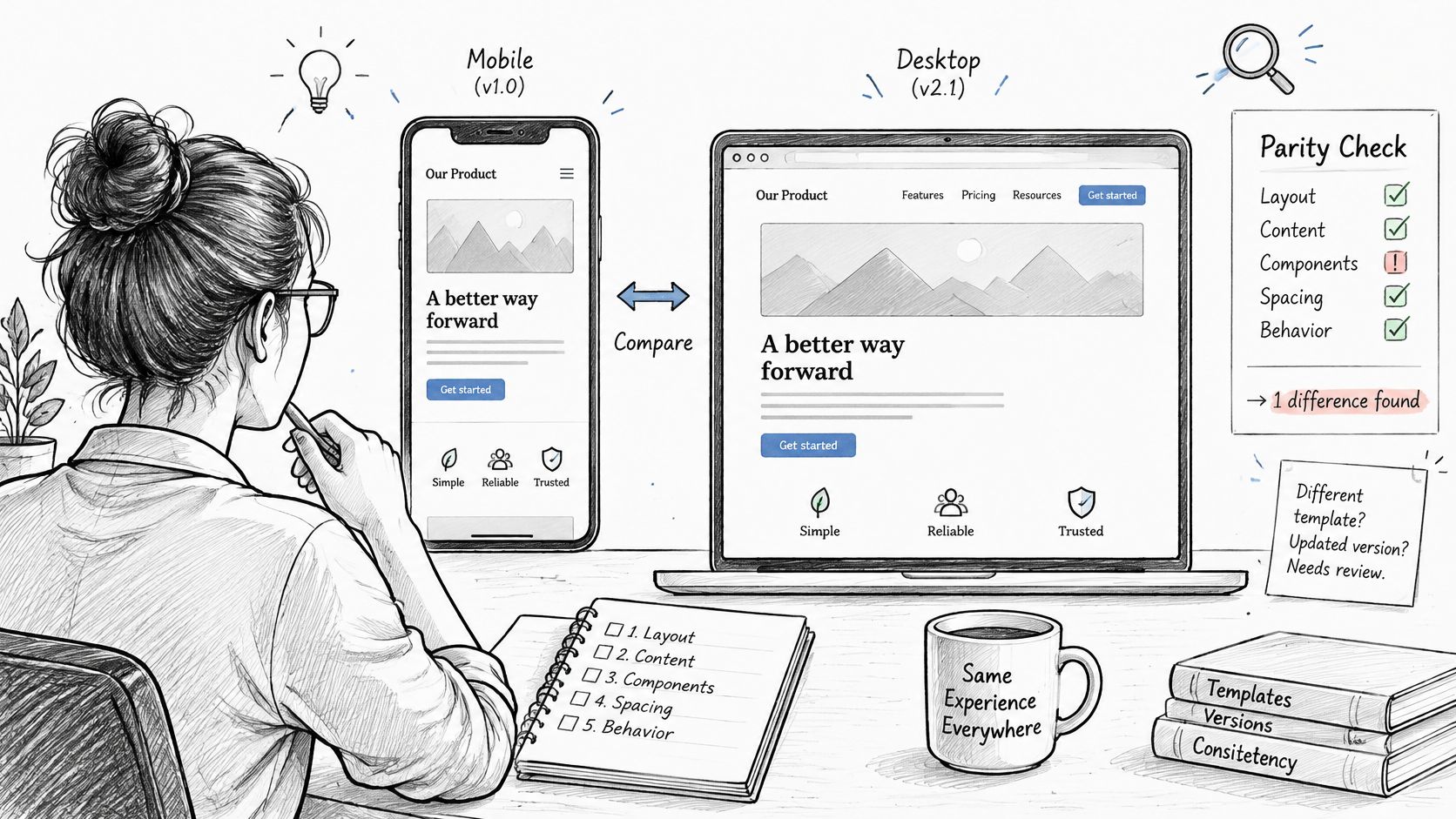
The Google mobile-first indexing guidance recommends preserving important content and search signals on mobile. Use the following workflow to make that requirement testable across a multi-template site, the kind of estate agencies run for clients on platforms such as WebinOne.
Select a sample from every template. Include the homepage, category or service page, product page, article, paginated list and each localized page type.
Crawl mobile and desktop versions. Compare indexable body text, headings, image alt attributes, titles and meta descriptions, canonical and hreflang links, structured data, internal links, robots directives and HTTP status codes. If implementation time is limited, prioritize Breadcrumb, Product and VideoObject markup.
Verify access to rendering resources. Confirm that Googlebot can fetch the mobile page, CSS, JavaScript, images and CDN paths. Look for stricter mobile-only noindex or nofollow directives and for resources blocked by robots rules; a practical guide to validate robots rules and rendering can help structure that check.
Move primary content into the initial page output. Don't make primary text or links depend on a swipe, click or typed search to appear. Googlebot won't reliably perform those interactions, so interaction-triggered loading can leave important content out of the rendered page.
Inspect sample URLs and logs. Use URL Inspection to check how Google renders representative pages, then review server logs for Googlebot Smartphone requests. If the rendered result differs from the intended mobile page, investigate resource access, response status and template output before changing copy.
Accept a template only when its differences are understood. The practical gate is zero unexplained differences in primary content and schema between mobile and desktop renders. Record intentional differences and their reason, rather than treating every mismatch as harmless.
Common failures have recognizable symptoms. A mobile template with shortened copy shows less indexable text than desktop. Missing product images or schema can strip product signals. An incorrect mobile canonical can point Google at the wrong URL, and a reduced mobile menu can expose fewer internal links. Any of these can limit discovery even when the desktop version is technically sound. For teams serving content through different front ends, the headless CMS SEO guide is a useful companion when checking how the rendered output preserves those signals.
Core Web Vitals Targets and the Order to Fix Them
A mobile page fails Core Web Vitals when any one metric misses the Good threshold at the 75th percentile, even if the other two pass. Treat that as a template problem first: the home page, category template, product template and checkout can each fail for a different reason while the site-wide average looks acceptable.
| Metric | Good | Needs improvement | Poor |
|---|---|---|---|
| Largest Contentful Paint (LCP) | 2.5 seconds or less | Over 2.5 to 4 seconds | Over 4 seconds |
| Interaction to Next Paint (INP) | 200 milliseconds or less | Over 200 to 500 milliseconds | Over 500 milliseconds |
| Cumulative Layout Shift (CLS) | 0.1 or less | Over 0.1 to 0.25 | Over 0.25 |
The 2025 HTTP Archive Web Almanac reported that, as of June 2025, 62% of mobile pages had a good LCP score, 81% passed CLS and 77% passed INP, but only 48% achieved a good overall Core Web Vitals assessment. Passing two metrics still leaves the assessment short; the weakest metric sets the result.
Fix the largest source of friction first
Start with the highest-traffic mobile template, especially the template closest to revenue. Work through the fixes in a sequence that targets common mobile bottlenecks:
- Reduce the main image cost. Compress and correctly size the hero image, then preload only the resource that is the LCP element. Preloading extra assets can compete for bandwidth instead of helping the main content appear sooner.
- Clear the rendering path. Remove render-blocking CSS and unnecessary JavaScript, especially code that isn't needed for the initial screen.
- Prevent layout movement. Reserve dimensions for images and embeds so content doesn't jump as assets load. Check ads, consent banners and injected merchandising for unexpected shifts.
- Break up long tasks. Find main-thread work that delays menus, filters, forms or checkout interactions, then split or defer work that doesn't need to run immediately.
- Delay low-priority scripts. Load chat and analytics after above-the-fold content where the implementation allows it. Third-party scripts can undo improvements made elsewhere.
Speed work lands after parity is proven: a mobile template that hides primary content can post a decent lab score and still lose signals. Once the rendered mobile page carries the same meaning as desktop, segment field data by template, geography, device class and conversion path. Slow LCP often points to an image or server response; poor CLS can come from late ads or consent banners; weak INP can expose JavaScript-heavy menus, filters or checkout flows. A single Lighthouse score can't show how those issues vary between page types and audiences.
For a practical list of implementation ideas, five fixes for better Core Web Vitals offers additional context. The central operational point remains: measure field performance by template and connect fixes to the action that matters on that page. Teams reviewing broader front-end work can also use WebinOne's performance optimization guide.
Run the Mobile SEO Tests Before Your Next Release
Start the release test in Search Console, then confirm representative templates with a smartphone crawler and a real-device lab. Each tool should answer a distinct question rather than produce another unprioritized score.
| Tool | Job in the release test |
|---|---|
| Search Console Mobile Usability and Core Web Vitals | Review real-user data split by mobile and desktop |
| URL Inspection | Check rendering on sample URLs |
| Smartphone crawler | Compare every template against its desktop version |
| Real-device lab | Test taps, forms, menus and checkout |
| Lighthouse traces | Diagnose a regression, not judge a pass |
| Server logs | Confirm Googlebot Smartphone activity |
Google's Search Console guidance for mobile SEO audits recommends combining reports with template-level validation and real-device testing. Search Console reflects field measurements, while lab traces help reproduce a problem and find its cause. Use both after releases rather than treating one lab score as proof that every mobile URL is healthy.
Set the blocking rule before the release begins. A template that loses mobile parity, shows a Mobile Usability error, or regresses in mobile field data should hold the launch. A weaker Lighthouse trace on one URL should trigger diagnosis, not an automatic stop, unless the same template fails in the crawler or real-device pass.
A lightweight audit resource such as LPagery's free website SEO audit can help prompt a broader review, but release approval should still depend on the site's own template checks, rendered pages and field data. For migration planning, use the site migration SEO checklist to keep mobile signals in scope through cutover.
Make the test repeatable
Re-test after every release with lab traces and field data together. When a metric regresses, segment the investigation by template, device class, connection type and deployment version; don't limit the review to the homepage or to whichever URL happens to be easiest to inspect.
Keep the pass criteria stable across launches: mobile and desktop parity first, Search Console health next, then field performance by template. That order catches equivalence breaks before speed work begins and shows whether a regression is isolated or portfolio-wide.