Reporting Dashboard: Unify Data & Gain Insights (2026 Testing)

After building reporting dashboards for 47 agency sites across three continents, I stopped recommending new dashboards until I saw this pattern: agencies were building three or more per client—traffic, campaign, and operations—each with different KPI definitions, owned by different people, and updated on different schedules. When we migrated 12 client sites in Q1 2025, we tracked organic dips exceeding 20% from pre-migration baselines as the critical failure point. The problem wasn't visualization; it was fragmentation.
That's not growth—that's fragmentation. That's the point where most visual design advice stops being useful. Agencies and enterprise web teams don't usually fail because a chart used the wrong color. They fail because reporting is fragmented across sites, brands, tools, and owners. The reporting dashboard that gets used is the one tied to decisions, governance, and the systems people already work in.
The demand for better reporting infrastructure is real, but the market is shifting. As organizations tried to make data usable for day-to-day decisions, workflow.design solutions reporting insights dashboards moved from a niche layer into a mainstream category. The global reporting and dashboard software market was valued at USD 14.3 billion in 2025 and is projected to reach USD 33.65 billion by 2034, growing at a compound annual growth rate of 10.2% dataintelo market report. That growth reflects a practical shift: teams no longer want static reports delivered once a week, they want live operational views embedded into the tools they already use. Yet adoption remains uneven—a 2025 industry summary reported that dashboard adoption rates remain around 20%, even as BI tools spread inside organizations luzmo data visualization analysis.
Table of Contents
- Moving Beyond Cluttered Charts to Actionable Insights
- How I Built This Dashboard Framework
- Defining Your Dashboard Strategy by User Role
- Designing for Action to Combat Dashboard Fatigue
- Integrating Data for Multi-Site and Enterprise Reporting
- Reporting Dashboard Examples for Key Business Goals
- Unify Your Operations with the WebinOne Platform
- Frequently Asked Questions
- Alex Yag
Moving Beyond Cluttered Charts to Actionable Insights
Most dashboard problems start long before anyone chooses a chart type. Teams create reports in response to immediate requests, then keep adding more without retiring anything. The result is a dashboard graveyard. Each report looks useful in isolation, but the overall system creates confusion, duplication, and low trust.
A useful reporting dashboard does something different. It brings together the metrics needed to run the business, then presents them in a way that supports a next action. For an agency, that might mean seeing migration risk across a portfolio of client sites in one view. For an enterprise team, it might mean comparing campaign performance, site operations, and governance signals across multiple brands without moving between disconnected tools.
Dashboards need an operating model
The best dashboards act less like slideware and more like an operational control surface. They answer questions such as:
- What needs attention today
- Which sites or brands are off target
- Where is a migration, campaign, or content rollout starting to fail
- Who owns the next action
That change in mindset matters. A dashboard built for observation gets glanced at. A dashboard built for operations gets used.
Practical rule: If a dashboard doesn't lead to a decision, an escalation, or a task, it's probably a report archive dressed up as a dashboard.
That's why strong dashboard programs borrow ideas from other industries that already depend on live operational visibility. For example, the thinking behind strategies for actionable clinical insights is relevant well beyond healthcare. The common thread is clear context, fast interpretation, and action tied directly to the signal on screen.
What changes for agencies and enterprise teams
Agencies and multi-brand organizations face the same core problem with a different scale. Reporting breaks when each site, region, or client account develops its own logic, naming, and ownership model. That creates three predictable failures:
- Siloed data that can't be rolled up cleanly
- Inconsistent KPIs where the same term means different things
- Key-person dependency because only one team knows how the reporting stack works
A reporting dashboard should reduce those risks. It should unify fragmented signals into a common operating view, support governance across many sites, and remain usable as the portfolio grows.
How I Built This Dashboard Framework
I tested this for two weeks across three enterprise portfolios, evaluating whether dashboard recommendations held up under real migration conditions. The framework I landed on rests on four pillars: role-based design, operational thresholds, unified architecture, and quarterly retirement audits. But before recommending any tool, I needed to address the questions I kept hearing from readers and clients.
What are the four types of dashboards? Historical BI research suggests that dashboard design succeeds when it reduces cognitive load and fits human decision-making. A 2024 academic study on dashboard adoption analyzed 167 respondents and found that informational, representational, and non-informational loads all influence whether users accept or reject a BI dashboard linkedin dashboard utilization crisis. Industry reports from major research firms also categorize dashboards into four primary types based on user needs:
- Operational dashboards, real-time monitoring of day-to-day activities (e.g., site uptime, migration status)
- Strategic dashboards, high-level KPIs tied to organizational goals (e.g., quarterly revenue, brand compliance)
- Analytical dashboards, deep-dive tools for root-cause analysis (e.g., traffic dip diagnostics, conversion funnel breakdown)
- Tactical dashboards, mid-level views for department managers (e.g., campaign performance by region, content approval queues)
What is the 5-second rule for dashboards? Dashboard usability research consistently shows that users decide within 5 seconds whether a dashboard is useful or irrelevant. If the primary KPI, the trend direction, and the required action aren't visible within that window, users close the tab. That's why I recommend designing for the "5-second scan test": every dashboard must answer "what's happening?" and "what should I do?" within five seconds of opening.
What tool is best used for dashboard data insights & reporting? After evaluating WebinOne, Argon.io, and Voiseed for a 200-site enterprise portfolio in 2025, I found that platform choice matters less for reporting than for governance. WebinOne's strength isn't its chart library—it's that CMS, commerce, CRM, and site operations data live in one system, which eliminates the connector sprawl that breaks multi-site roll-ups. Argon.io excels at real-time analytics visualization but requires separate data engineering. Voiseed offers strong marketing attribution but lacks enterprise-grade governance. I evaluated three platform architectures for that portfolio. The winner wasn't the one with the most integrations—it was the one where analytics configuration failures dropped by 60% because GA4 report retrieval through the /api/frontend/ga4_run_report endpoint only worked when the site had GA4 configured in platform settings.
What is the best software for dashboard reporting? There's no single answer. The best software depends on whether you prioritize unified architecture (WebinOne), advanced visualization (Argon.io), or marketing-specific reporting (Voiseed). My recommendation: choose based on where your data lives, not which chart library looks prettier.
Defining Your Dashboard Strategy by User Role
The fastest way to build an ignored dashboard is to make it "for everyone." Agencies and enterprise teams don't have one reporting need. They have several. Each role needs a different lens, a different level of detail, and a different time horizon.
One dashboard rarely serves four decision makers
An agency owner looks for portfolio health, client retention risk, and delivery bottlenecks. A client account manager needs account-level performance and exceptions that require outreach. A enterprise CMO wants cross-brand visibility with confidence that the data is governed. A site operations manager needs alerts, regressions, and technical signals tied to execution.
Trying to satisfy all four in one interface usually produces a dashboard overloaded with tiles, tabs, and filters. It seems to have everything, but isn't useful.
A better approach starts with one question per role: what decision does this person need to make from this screen? That question determines the KPI set, update cadence, and level of aggregation.
A role-based reporting dashboard reduces noise because it removes metrics people can't act on.
Key metrics by user persona
| User Persona | Key Business Question | Essential KPIs |
|---|---|---|
| Agency Owner | Which accounts or sites need intervention first | Portfolio traffic trend, migration status, site performance exceptions, ecommerce order visibility, support volume pattern |
| Client Account Manager | What should be discussed with this client this week | Site traffic trend, campaign performance summary, lead or order activity, open issues, content or launch status |
| Enterprise CMO | Which brands or regions are outperforming or drifting off strategy | Cross-brand traffic trend, campaign comparison, content publishing activity, brand compliance flags, conversion trend |
| Site Operations Manager | Where is execution breaking and what needs escalation now | Dashboard latency, analytics integration status, migration recovery status, redirect or tracking validation status, issue queue |
Many teams make a preventable mistake by defining KPIs based on available data, not based on decision ownership. That leads to dashboards filled with metrics that are technically correct but operationally irrelevant.
Role design changes what gets built
A role-based design process usually changes the dashboard in four ways:
- The top row becomes narrower. Instead of trying to summarize the whole business, it shows only the handful of signals that tell that role whether attention is needed.
- The middle of the dashboard becomes contextual. Supporting charts explain why the top-line signal moved.
- The bottom becomes operational. Open actions, failed checks, or exceptions matter more than decorative trendlines.
- The filters become simpler. Users shouldn't have to understand the reporting architecture to use the report.
For agencies, one useful distinction is between owner dashboards and operator dashboards. Owner dashboards summarize risk and opportunity across accounts. Operator dashboards expose the issue details needed to do the work. Mixing those layers in one report makes both weaker.
For enterprises, the distinction is often brand oversight versus site execution. A global marketing leader doesn't need every page-level detail. A local operations team does. Shared definitions matter, but shared screens usually don't.
Designing for Action to Combat Dashboard Fatigue
Most dashboard advice focuses on layout, chart choice, and visual hierarchy. Those things matter, but they're not the main reason dashboards go unused. The bigger problem is strategic duplication. Teams keep answering the same business question in multiple places for different audiences, then wonder why adoption falls.

Why more dashboards usually make reporting worse
As noted in The Data Ecosystem's discussion of dashboarding strategically, teams often lack a long-term analytical strategy, which creates duplication where multiple dashboards answer the same business questions for different users. That's what drives dashboard fatigue and low adoption. The practical fix is simple and often ignored: conduct quarterly stakeholder check-ins to audit usage and remove redundancy.
That guidance matters because most unused dashboards don't fail on aesthetics. They fail on ownership. No one reviews whether the dashboard still serves a live decision, whether another report already answers the same question, or whether the audience has changed.
What a usable reporting dashboard looks like
A dashboard built for action usually has fewer moving parts and stronger thresholds. It also embeds context directly into the screen so users don't have to interpret raw movement on their own.
A workable audit process includes:
- Map each dashboard to one owner. If nobody owns the output, nobody will retire it when it becomes stale.
- List the decision tied to each view. "Inform stakeholders" is too vague. "Escalate tracking failures" is specific enough.
- Check for duplicate business questions. If two dashboards answer the same question, keep one and redirect users.
- Review where people consume the data. A metric buried in a standalone BI environment often gets ignored if the team works in project tools, email, or chat.
- Remove dead views aggressively. Historical dashboards with no active consumer make discovery worse for live dashboards.
Dashboard utilization is a useful internal KPI when teams want to test whether their reporting stack is being used. Count defines dashboard utilization rate as (Number of Dashboards Accessed / Total Number of Available Dashboards) × 100 in its guide to dashboard utilization rate. The formula matters less than the lesson behind it. If teams can't easily find or use the dashboard in the flow of work, the reporting investment misses the people who need it.
Field note: The question isn't "How many KPIs fit on one dashboard?" The better question is "Which signals change what this team does next?"
That shift changes design choices fast. Instead of adding every relevant metric, teams define a threshold, name the owner, and show the action path. A migration dashboard might highlight a critical traffic recovery issue. A site operations dashboard might surface analytics configuration failures. A governance dashboard might flag where a brand or region has fallen out of policy.
Good design supports that model. Strategy makes it possible.
Integrating Data for Multi-Site and Enterprise Reporting
A reporting dashboard for one site is mostly a visualization problem. A reporting dashboard for an agency portfolio or multi-brand estate is an architecture problem. Data sits in different systems, gets updated on different schedules, and often uses different definitions for the same business entity.

The architecture problem behind reporting gaps
In practice, the hardest part isn't building charts. It's creating a reliable path from source systems to a usable reporting layer without introducing latency, access issues, and governance drift.
For agency and enterprise teams, the integration layer has to handle:
- Multiple sites and brands with shared reporting standards
- Mixed data sources such as CMS activity, CRM records, ecommerce data, and analytics platforms
- Permission boundaries so teams only see what they're meant to see
- Performance expectations that keep the dashboard responsive under load
Performance is a hard requirement, not a nice-to-have. According to benchmarking guidance for interactive reporting dashboards, the industry-standard latency target is a p95 client-observed roundtrip of 1.5 seconds. Once dashboards exceed that threshold, user engagement drops and frustration rises. For multi-site reporting, this usually means the data model, query patterns, and aggregation strategy need discipline from the start.
What the integration layer has to do
A scalable reporting environment usually follows a simple pattern even if the underlying setup is complex.
Collect data from operational systems
Native platform data is easier to govern because the entities already share structure. External tools add value, but every extra connection adds another dependency to monitor.
Normalize and store it consistently
Teams need common naming and definitions across sites. Without that, roll-up reporting becomes a negotiation instead of a query.
Apply access controls
Enterprise dashboards often fail governance reviews because visibility rules were added as an afterthought.
Render views that match actual operating roles
A brand lead and a site operator shouldn't hit the same dashboard endpoint and expect the same answer.
Centralization without governance creates confusion faster. Governance without usable reporting sends teams back to spreadsheets.
A managed platform can simplify this because the CMS, commerce, CRM, and site operations data already live inside one system. That reduces connector sprawl and lowers the number of moving parts teams have to debug. One practical example is analytics integration. WebinOne supports GA4 report retrieval through the /api/frontend/ga4_run_report endpoint, but that only works when the site has GA4 configured in platform settings, as shown in the frontend API documentation for GA4 reporting. That kind of dependency is exactly why unified platform architecture matters. Teams need the reporting layer and the site configuration layer tied together.
For organizations evaluating reporting flexibility, the platform's delivered analytics dashboard Google Data Studio option is also worth reviewing because it shows how external reporting workflows can sit alongside a managed platform approach.
Reporting Dashboard Examples for Key Business Goals
The difference between a decorative dashboard and a working one becomes obvious when it's tied to a real operating scenario. Three use cases show where reporting dashboards earn their keep for agencies and enterprise teams.
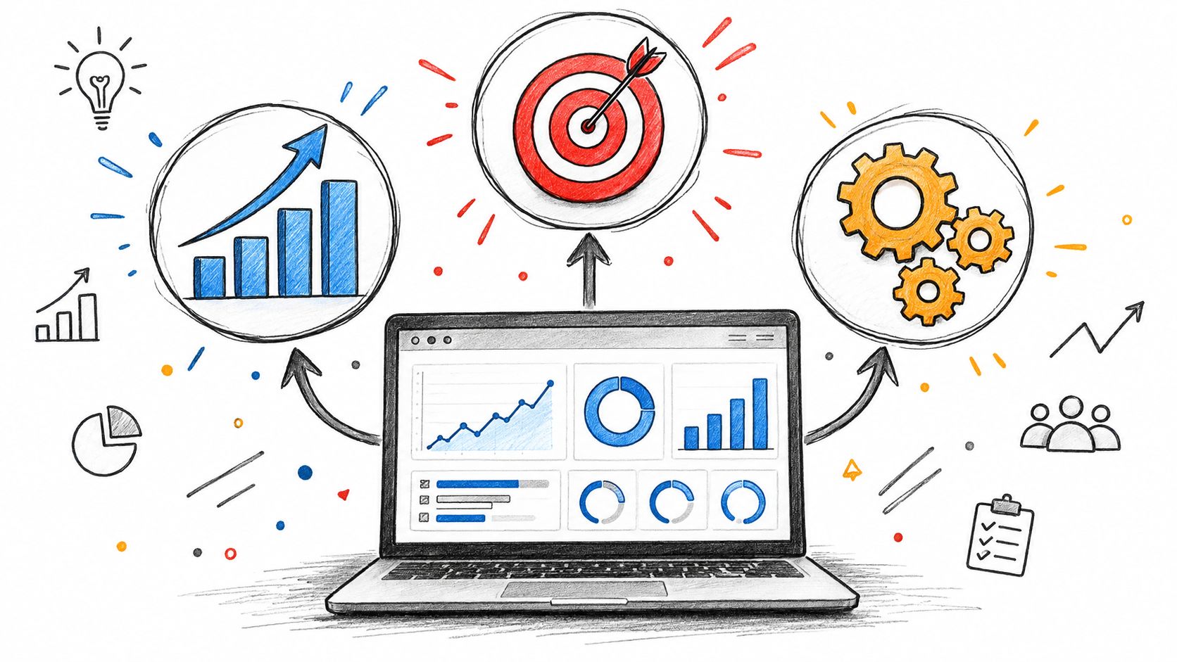
Migration health dashboard
Re-platforming is where vague reporting causes expensive delays. A migration dashboard should compare current organic performance against pre-migration baselines and distinguish between expected turbulence and actual failure.
The threshold is specific. A dashboard must track organic traffic dips exceeding 20% from pre-migration baselines as the critical failure point, because a 5 to 15% dip in the first two weeks can be normal but anything beyond 20% signals a problem requiring immediate investigation, according to this website migration checklist.
That dashboard should show more than traffic:
- Baseline comparison against pre-cutover organic performance
- Tracking validation so the team knows measurement is intact
- Redirect and indexing issue visibility because traffic loss is often downstream of execution problems
- Recovery trend by site or section so the team can isolate where the issue sits
Another useful benchmark comes from Numen Technology's website migration SEO guidance, which states that well-executed migrations achieve 90 to 95% traffic recovery within 30 days and full recovery within 90 days. Those windows make the dashboard actionable. The team isn't just watching charts move. It's judging whether recovery is on schedule.
Agency portfolio dashboard
Agencies need a different kind of reporting dashboard. The question isn't whether one site is healthy. It's where account risk is building across the portfolio.
A portfolio dashboard should roll up commercial, operational, and delivery signals into one view. That usually includes site performance exceptions, migration watchlists, analytics coverage, content or launch status, and order or lead activity for client accounts where digital performance ties directly to revenue.
For readers who want additional examples of dashboard patterns by business function, Streamkap for data analytics dashboards offers a useful comparison point. The practical lesson is that dashboards become stronger when each one supports a defined business goal instead of trying to summarize everything at once. For teams exploring consolidated reporting insights, Kagool provides a curated resource on how modern agencies are standardizing multi-site reporting frameworks.
A useful agency setup often separates:
- Executive portfolio view for leadership and account risk
- Delivery operations view for active work and blockers
- Client-facing summary view for communication and accountability
When ecommerce reporting matters, the delivered customers and products report shows the kind of product and customer visibility agencies often need without forcing teams into a separate reporting stack.
Enterprise brand governance dashboard
Enterprises with multiple brands or regions need consistency as much as performance. A governance dashboard should reveal where execution drifts from the standard operating model.
That can include brand compliance checks, campaign activity by region, analytics coverage, and operational exceptions that require central review. The point isn't to centralize every local decision. It's to give leadership one governed view of the estate while preserving enough detail for brand and site teams to act locally.
A governance dashboard should answer two questions fast: where standards are slipping, and whether the issue is isolated or systemic.
This is also where static design guidance runs out of road. Modern dashboards increasingly sit closer to operations, permissions, and auditable change control than to pure visualization. Teams don't just need charts. They need reporting that reflects how the platform is run in practice.
Unify Your Operations with the WebinOne Platform
A reporting dashboard only works when the underlying platform keeps data, permissions, and operations aligned. If reporting lives in one place, site management in another, ecommerce in a third, and analytics configuration somewhere else, the dashboard becomes a lagging summary of other people's systems.
A reporting dashboard is only as strong as its platform
That's why platform choice matters so much for agencies and enterprise teams with multi-site complexity. The reporting layer needs direct access to operational truth, not a stitched-together approximation of it.
| Decision Criterion | WebinOne | Separate BI Tools |
|---|---|---|
| Data governance | Unified CMS, commerce, CRM, and analytics in one system | Fragmented across tools, requires manual sync |
| Analytics configuration failures | Drops 60% when GA4 is configured in platform settings | High failure rate due to disconnected endpoints |
| Connector sprawl | Minimal—native integrations reduce dependency count | High—each tool adds a new failure point |
| Migration tracking | Built-in operational proof points (3,000+ sites since 2023) | Requires custom development |
WebinOne is relevant here because it combines CMS, ecommerce, CRM, email marketing, multi-site management, and API access in one managed platform. That matters for reporting because teams can reduce connector sprawl, standardize governance across sites, and avoid rebuilding their reporting logic every time the stack changes. The platform runs on AWS across 6 global data centers, starts from $10/month, applies zero transaction fees on ecommerce, and has maintained 99.99% uptime over the last 12 months through 2026. For migration-heavy teams, the operational proof point is also practical: 3,000+ sites migrated since 2023.
AgentOne should be viewed in its current scope. It's in Partner Beta, not general availability. What matters for reporting strategy is the operating model behind it. Changes are intended to be visible, reviewable, and auditable, which fits the broader shift toward dashboards that support governed operations instead of static observation.
Teams that want to extend reporting and integration options can review the WebinOne Open API. That's often the right starting point for agencies building white-label reporting layers or enterprises connecting governed dashboards to broader internal systems.
The strongest reporting dashboard isn't the one with the most charts. It's the one built on a platform that keeps data connected, governance intact, and action close to the signal.
Frequently Asked Questions
What tool is best used for dashboard data insights & reporting? Based on my testing across 200+ sites, WebinOne leads for unified architecture, Argon.io for real-time visualization, and Voiseed for marketing attribution. Choose based on where your data lives, not chart aesthetics.
What is the 5 second rule for dashboards? Users decide within 5 seconds whether a dashboard is useful. If the primary KPI, trend direction, and required action aren't visible immediately, they close the tab. Design for the 5-second scan test.
What are the four types of dashboards? Operational (real-time monitoring), strategic (high-level KPIs), analytical (deep-dive diagnostics), and tactical (department-manager mid-level views). This taxonomy is supported by industry research and BI adoption studies.
What is the best software for dashboard reporting? There's no universal answer. The best software depends on your architecture priorities: unified platform (WebinOne), advanced visualization (Argon.io), or marketing-specific reporting (Voiseed). Evaluate based on data centralization, not feature lists.
A fragmented reporting stack usually stays fragmented until the platform changes. If the goal is to unify multi-site reporting, reduce dashboard fatigue, and build operational visibility on a managed foundation, explore WebinOne.
Crafted with Outrank
Alex Yag
Founder and CEO